Discover the Portal
The Reemo portal has the same structure for every user. Only the menu entries change, depending on your role and on the features enabled on your instance or organization.
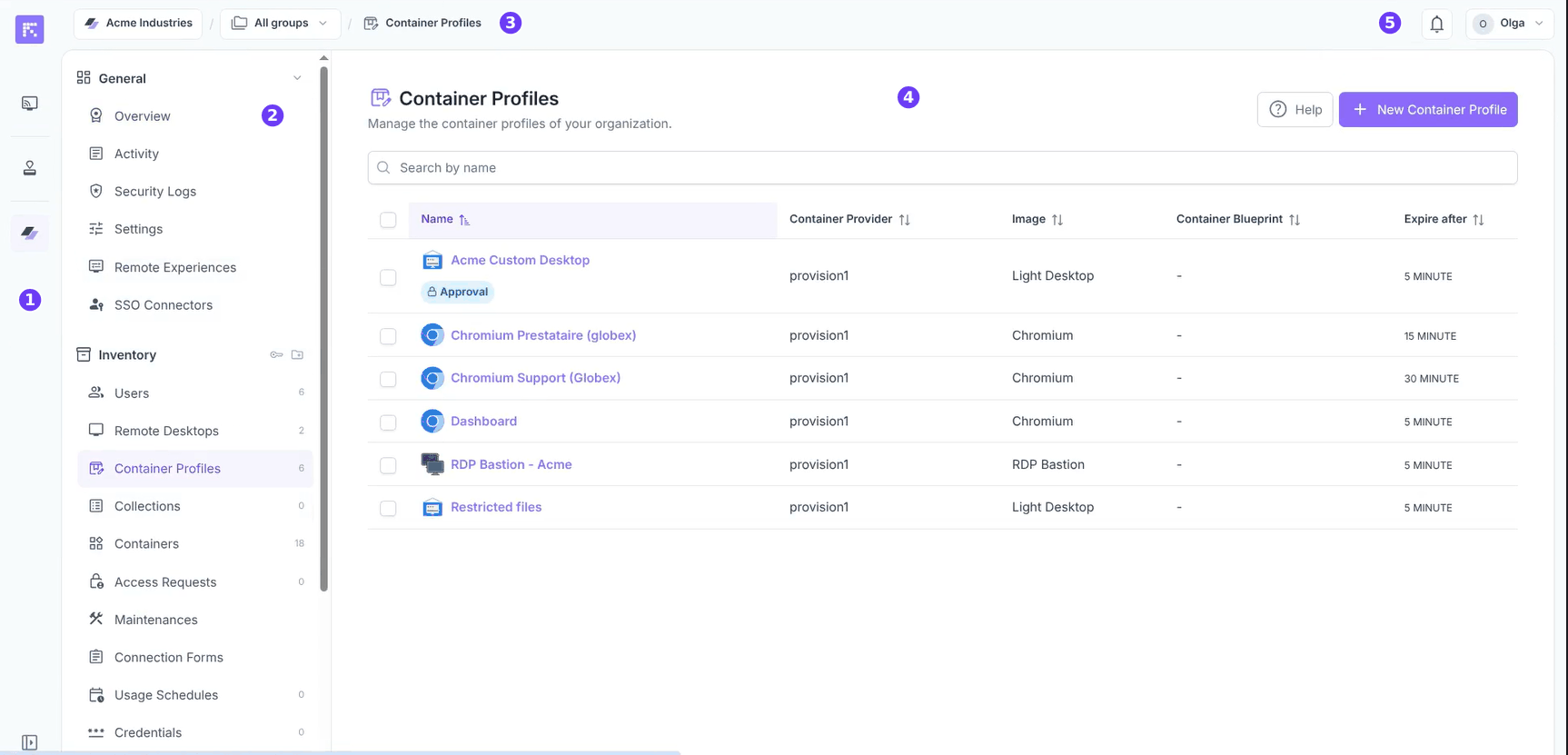
Overview
Icon bar: on the left of the screen, it gives access to the main areas of the portal.
Organization menu (or Admin Area menu): it groups the pages of the area you opened.
Breadcrumb: at the top of the page, it shows where you are and lets you switch organization or group.
Content: the current page.
Top bar: on the right, the notifications and the user menu.
Icon bar
The main navigation stays visible on the left of the screen. It takes two forms: a menu with labels, or the narrower icon bar alone. The button at the bottom left of the screen switches between the two.
For example, on the Resources and My Approvals pages the menu with labels is shown; inside an organization or the Admin Area the icon bar is shown, with the area’s menu next to it.
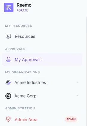
The menu with labels, as it appears on the Resources and My Approvals pages.
Whichever form it takes, the navigation contains:
Resources: your machines, containers and pools (see Resources Dashboard).
Approvals: visible if your organization has enabled the approval workflow and you are an approver (see My Approvals).
One icon per organization you administer (see Interface Tour).
verified_user Admin Area: reserved for instance administrators (see Getting Started).
Top bar
The top bar gives access to your account tools:
Talk to CSM: contact your Customer Success Manager, if applicable.
Upgrade Plan: manage your subscription plan, if applicable.
Alerts (): this bell, to the left of the notifications bell, appears when Alerting is enabled. Its menu shows the latest alerts, then View alerts in followed by the instance and your organizations, depending on your rights (see Alerting).
Notifications (): view recent system notifications (see Notifications).
User Menu: your account settings, theme, language and other session-related tools (see below).
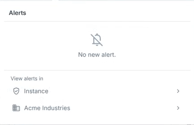
The alerts menu.
User Menu
The User Menu (click your name in the top-right corner of the navigation bar) gathers the tools related to your account and current session:
manage_accounts Settings: manage your profile, security, and devices (see Account Settings, which includes your Personal Key under the General tab).
Theme: switch between the portal’s light and dark theme.
Language: change the portal’s display language.
Support: access the Reemo support site, reemo.io/support.
Download: download the Reemo Agent installer (see Install the Reemo Agent).
Add to Home Screen and Sign Out.
Detail pages and forms
When you open an item (an image, a group, a container profile) or create one, a page opens on the right of the screen, over the current page. It comes in two forms: the detail page and the form. Click the cross at the top left to close it.
Detail page
The detail page shows the details of an item:
The header shows the item’s name and, depending on the case, its image or type. The available actions (for example Maintenance, Duplicate, Edit) are on the right of the header.
The left menu gives access to the pages of the detail page. Its entries are grouped under headings (for example Resources or Security), and a counter shows the number of linked items.
The Overview page shows summary cards and the main information.
Delete is at the very bottom of the left menu.
In a detail page opened from another detail page, the Back button returns to the previous one.
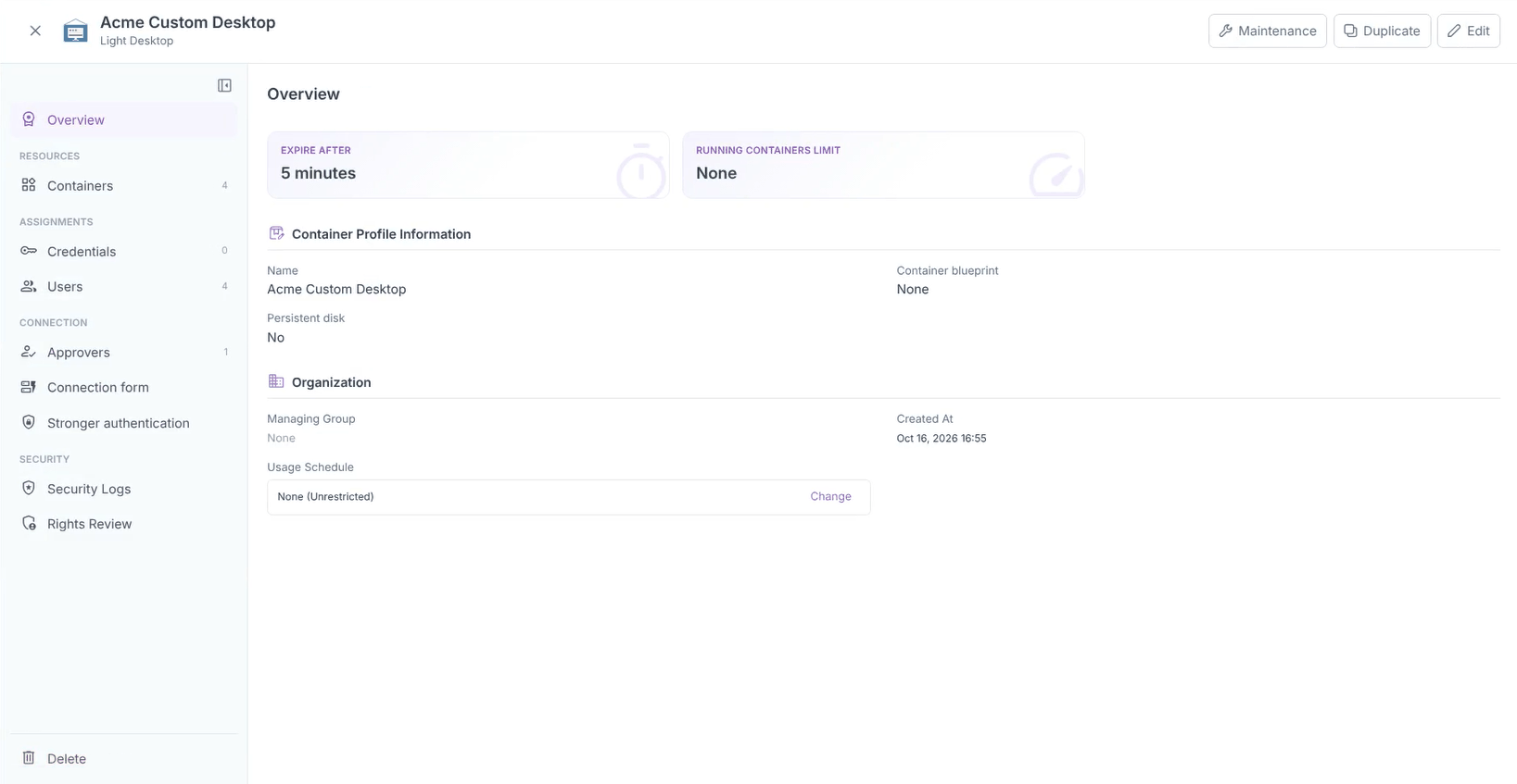
Example of a detail page: the Overview page of a container profile.
Form
The form is used to create or edit an item. It shows fields and ends with a confirmation button (for example Create) and Cancel. When creation takes several steps, the Previous and Next buttons let you move through them.
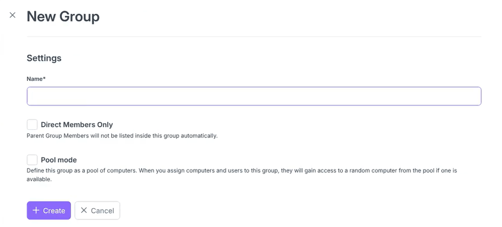
Example of a form: creating a group.
What each role sees
Role |
Icon bar |
|---|---|
User |
Resources, and Approvals if you are an approver. |
Organization administrator |
The same entries, and one icon per administered organization. |
Instance administrator |
The same entries, the organizations, and Admin Area. |
Going further
Resources Dashboard: connect to your resources from the dashboard.
Interface Tour: getting started with organization administration.
Getting Started: getting started with the Admin Area.